What does Flutter Carousel mean?
A Carousel is a Multiple set of items that slide on a particular time span. It may be a collection of images, texts, or other elements inside an item that generally slides toward the left automatically. It is used to show a bundle of elements to the user without doing any action in the form of an auto slide. The best example we can see is testimonials, in which the client’s message comes on the screen for a short interval of time & slides to other clients’ messages. The auto slide continues until the user stays at the component. A carousel is also referred to as a slider or known as a carousel slider for flutter. In today’s real-time world of applications, Carousel plays a very important role either for web apps or mobile apps. Applications like e-commerce, news, food delivery, etc use the sliding carousels to show offers, upcoming products, variants & more.What is GF Carousel for Flutter?
GF Carousel is a GetWidget UI widget for Flutter Carousel Slider that allows you to build a beautiful & easily customized carousel for your Flutter application. GF carousel has different types of carousel that can be used according to the flutter developers' requirements. Flutter Carousel Widget is a multi-section container & each section can be swiped or dragged between for a particular time spam. It contains n number of slide components. It can be used with background images, blocks & gradient colors as well.Types of GF Carousel - A Flutter Carousel Widget:
Flutter Full-width Carousel Slide With Text:
It can be used as a Gradient background and background Images as a background with the full width of the screen that consists of some titles & short descriptions as its child element.Flutter Multiple items Carousel With Text
It can be used as a Gradient background and background Images as a background in small pieces by which we can show multiple items in a row having child elements for each within the item.Flutter Full-Size Carousel Slider with Dots Indicator
The full-size flutter carousel slider is quite similar to Full-width Carousel having a full-width screen size with additional slider dots carousel within the item. It is generally used to showcase your major categories on your application. The best daily life example is an eCommerce application, where we can at the top of the home screen there is some slider with their current running offers and major categories that they want to feature to the users. So if your app does have requirements or you would like to showcase your specific products/services pages to your users then you should try a full-screen flutter carousel slider with dots. So users can pause and read your information and go to those pages.How to Get Started Flutter Carousel Slider Widgets
If you are new with GetWidget then you should go ahead with Getwidget Flutter Docs will guide you on how to start building a beautiful application with the GetWidget flutter UI library. You have to install the package from pub.dev, and import the package into your Flutter project.Install Package from pub.dev :https://pub.dev/packages/getwidget
Import full package:
import 'package:getwidget/getwidget.dart'; Note: dependencies: getwidget: ^4.0.0Keep playing with the pre-built UI components.Example to add Flutter Carousel Widget in your Flutter App:
import 'package:getwidget/getwidget.dart';

final List imageList = [
  "https://cdn.pixabay.com/photo/2017/12/03/18/04/christmas-balls-2995437_960_720.jpg",
  "https://cdn.pixabay.com/photo/2017/12/13/00/23/christmas-3015776_960_720.jpg",
  "https://cdn.pixabay.com/photo/2019/12/19/10/55/christmas-market-4705877_960_720.jpg",
  "https://cdn.pixabay.com/photo/2019/12/20/00/03/road-4707345_960_720.jpg",
  "https://cdn.pixabay.com/photo/2019/12/22/04/18/x-mas-4711785__340.jpg",
  "https://cdn.pixabay.com/photo/2016/11/22/07/09/spruce-1848543__340.jpg"
];

 GFCarousel(
    items: imageList.map(
     (url) {
     return Container(
       margin: EdgeInsets.all(8.0),
       child: ClipRRect(
         borderRadius: BorderRadius.all(Radius.circular(5.0)),
          child: Image.network(
             url,
             fit: BoxFit.cover,
              width: 1000.0
           ),
        ),
      );
      },
     ).toList(),
    onPageChanged: (index) {
      setState(() {
        index;
      });
    },
),How to create a Card Carousel in Flutter?
A carousel in Flutter is a set of items that scrolls in a linear fashion in a given interval of time. It is helpful to give a piece of information to the user about a certain topic, or it may be testimonials of previous users about the application or news about the products, or even the offers. In these cases, the carousel works a lot better than other components. A carousel is also called or known as slider which can be a simple image slider or with some text and description on the slider. GFCarousel is a GetWidget component that has many slides in it and scrolls automatically in certain time intervals with animation effects in them. However, the Carousel can contain images, texts, images with texts on it, and so on according to the need of the application. We can have multiple images in one slider or just a single image in one slider. GFCarousel is totally customizable according to the needs of the application. As it will automatically slide to the next item the look and feel will be eye-catching to the user. GFCarousel can be manual too according to the need. GFCarousel can have one item in each slide or more than one item too. It can have multiple items on each slide. In other words, GFcarosuel supports multiple items in a single slide. GF Flutter Card Carousel has a GFCard inside a GFCarousel and it scrolls to give more slides automatically or it can be done manually too. Let's see the example of GFCard inside the GFCarousel to have a complete look at the GFCard Carousel.GFCard has certain types in it. For example, it can be a Card with an overlay image, Text, or just an image. All the types can be used inside a GFCarousel. For different types of GFCard and their uses, head to our official Flutter documentation. or hire flutter developer from Get Widget for installationFlutter GetWidget Docs
Get Widget is one of the largest Flutter open-source UI Kit libraries for mobile or web apps. It has more than 1000+ pre-built reusable widgets.
 getwidget
Example code of the GF Flutter carousel
final List imageList = [
  "https://cdn.pixabay.com/photo/2017/12/03/18/04/christmas-balls-2995437_960_720.jpg",
  "https://cdn.pixabay.com/photo/2017/12/13/00/23/christmas-3015776_960_720.jpg",
  "https://cdn.pixabay.com/photo/2019/12/19/10/55/christmas-market-4705877_960_720.jpg",
  "https://cdn.pixabay.com/photo/2019/12/20/00/03/road-4707345_960_720.jpg",

];

 GFCarousel(autoPlay:true;
    items: imageList.map(
     (url) {
     return Container(
       margin: EdgeInsets.all(8.0),
       child: ClipRRect(
         borderRadius: BorderRadius.all(Radius.circular(5.0)),
          child: Image.network(
             url,
             fit: BoxFit.cover,
              width: 1000.0
           ),
        ),
      );
})Examples using GF Flutter Card in a carousel
final List imageList = [
  "https://cdn.pixabay.com/photo/2017/12/03/18/04/christmas-balls-2995437_960_720.jpg",
  "https://cdn.pixabay.com/photo/2017/12/13/00/23/christmas-3015776_960_720.jpg",
  "https://cdn.pixabay.com/photo/2019/12/19/10/55/christmas-market-4705877_960_720.jpg",
  "https://cdn.pixabay.com/photo/2019/12/20/00/03/road-4707345_960_720.jpg",
  "https://cdn.pixabay.com/photo/2019/12/22/04/18/x-mas-4711785__340.jpg",
  "https://cdn.pixabay.com/photo/2016/11/22/07/09/spruce-1848543__340.jpg"
];

 GFCarousel(
 autoPlay:true,
    items: imageList.map(
     (url) {
     return GFcard(
     showImage:true,
     boxFit:BoxFit.cover,
     image:Image.network(url, fit:BoxFit.cover),
     content:Text(' some quick example text')
     buttonBar:GFButtonBar(
     children:[
     GFButton(
     text:'Buy'
     )
     ]
     )
      ),
      );
      },
     ).toList(),
    onPageChanged: (index) {
      setState(() {
        index;
      });
    },
),How to create a basic image carousel
Flutter Carousel Slider Widget is a collection of items that is mainly images that slide towards the left in a linear manner within a given time span. It is useful in displaying the features of a product in a set of images that users can understand about the product. A carousel in other words is a continuous loop of images or that can even be a bunch of texts according to the need. Basic Image Carousel is a group of images that forms like a slideshow in a loop that repeats one after the other in a given time of interval which can be automatic or manual. GFCarousel is a simple flutter carousel that is a slideshow of images. In GFcarousel we can have a lot of customization options wherein the slides can be a set of images, a bunch of texts, or even texts on the image as an overlay image. GfCarousel can have one image in a slide or multiple images in just one slide. It all depends on the need of the application. Hence FCarousel is totally customizable with many options in it. GFcarousel has navigation dots wherein the color, size of the dots is totally customizable. the dots can even be removed if the application does not want to have them. Navigation dots are simply a dot for next and previous control indicators. GfCarousel can be fullscreen or half of the screen height. The fullscreen will take the whole height of the screen to render the slides in a linear fashion one after the other in a given span of time whereas half screen is simply a half-height of the whole screen and has all the customizable properties just like fullscreen GFCarousel. For more customization options of GFcarousel and its uses, head to our official documentationGF Flutter Carousel Widget
GF Flutter Carousel widget custom develop Carousel with many custom properties full width, Full Size and use with Flutter Image component.
getwidget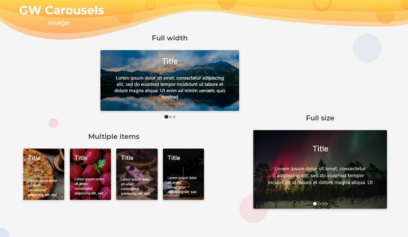
Example of a basic Flutter image carousel using GFCarousel
final List imageList = [
  "https://cdn.pixabay.com/photo/2017/12/03/18/04/christmas-balls-2995437_960_720.jpg",
  "https://cdn.pixabay.com/photo/2017/12/13/00/23/christmas-3015776_960_720.jpg",
  "https://cdn.pixabay.com/photo/2019/12/19/10/55/christmas-market-4705877_960_720.jpg",
  "https://cdn.pixabay.com/photo/2019/12/20/00/03/road-4707345_960_720.jpg",

];

 GFCarousel(autoPlay:true;
    items: imageList.map(
     (url) {
     return Container(
       margin: EdgeInsets.all(8.0),
       child: ClipRRect(
         borderRadius: BorderRadius.all(Radius.circular(5.0)),
          child: Image.network(
             url,
             fit: BoxFit.cover,
              width: 1000.0
           ),
        ),
      );
      })
How to Create a Background Image Carousel
A flutter carousel is a component that has several sets of images as items in it that slide one after the other in a given time fashion. It can have several images in which the user can scroll through them manually or automatically. GFCarousel is a carousel widget that has a set of images that slides one after the other in a linear manner repeatedly. GFCarousel has a fullScreen and HalfScreen type of carousel in it. GFcarousel is a slider widget that not only has images as its items but also texts and even overlays images and texts on the image. For more customization options of GFcarousel and its uses, head to our official documentation.GF Flutter Carousel Widget
GF Flutter Carousel widget custom develop Carousel with many custom properties full width, Full Size and use with Flutter Image component.
getwidgetHow to Create a Carousel with Flutter
Flutter Carousel or image slider is a slider with sets of images that scrolls or slides one after the another in a linear fashion in the time set. The carousel can be a set of images or a set of paragraphs depending upon the requirement. GFcarousel is a flutter Carousel that has a set of images in its slides that will automatically or can even be a manual slide. GFcarousel can have multiple images in one slide or only one image per slide as the requirement demands. The slides can have paragraphs that will be widely used in testimonials to give brief information about the product and its review.How to create an image carousel slider demo:
Flutter Image Carousel or Image slider is a carousel or slider with a set of images that scrolls or slides one after the another in a linear fashion in the time set. The image carousel has mainly images in the slides as the name implies. The slides can have paragraphs too. GFcarousel is a flutter Carousel that has a set of images in the slide that will automatically slide one after another or can even be a manual slide. GFcarousel can have multiple images in one slide or only one image per slide as the requirement demands. Images can be static and dynamic according to the need. The images can be one at a time for one slide or multiple images for one slide. The example below gives the multiple images per slide wherein there can be three images in a row for each slide. The images can act like an overlay on which there will be some text written on it. The example below shows the overlay image with text on it.Now let's have a look at the basic image carousel using GFCarousel.
final List imageList = [
  "https://cdn.pixabay.com/photo/2017/12/03/18/04/christmas-balls-2995437_960_720.jpg",
  "https://cdn.pixabay.com/photo/2017/12/13/00/23/christmas-3015776_960_720.jpg",
  "https://cdn.pixabay.com/photo/2019/12/19/10/55/christmas-market-4705877_960_720.jpg",
  "https://cdn.pixabay.com/photo/2019/12/20/00/03/road-4707345_960_720.jpg",

];

 GFCarousel(autoPlay:true;
    items: imageList.map(
     (url) {
     return Container(
       margin: EdgeInsets.all(8.0),
       child: ClipRRect(
         borderRadius: BorderRadius.all(Radius.circular(5.0)),
          child: Image.network(
             url,
             fit: BoxFit.cover,
              width: 1000.0
           ),
        ),
      );
      })
How to Create Dynamic Auto Image Slider
Flutter Carousel or Flutter Slider is a collection of items that is mainly images that slide towards the left in a linear manner within a given interval of time span. It is useful in displaying a product's features in a set of images that users can understand about the product. A carousel in other words is a continuous loop of images or that can even be a bunch of texts or paragraphs according to the need. GFCarousel is a simple flutter carousel that is a loop of images. In GFcarousel we can have a lot of customization options wherein the slides can be a set of images, a bunch of texts, or even texts on the image as an overlay image. GfCarousel can have one image in a slide or multiple images in just one slide. It all depends on the need of the application. Hence GFCarousel is totally customizable with many options in it. GFcarousel has navigation dots wherein the color, and size of the dots are totally customizable. Navigation dots are simply a dot for the next and previous control indicators. GFCarousel can be fullWidth or half of the screen height. The fullWidth will take the whole width of the screen to render the slides in a linear fashion one after the other in a given span of time. For more customization options of GFcarousel and its uses, head to our official documentation.GF Flutter Carousel Widget
GF Flutter Carousel widget custom develop Carousel with many custom properties full width, Full Size and use with Flutter Image component.
getwidgetDemo Example code for image carousel using GFCarousel
final List imageList = [
  "https://cdn.pixabay.com/photo/2017/12/03/18/04/christmas-balls-2995437_960_720.jpg",
  "https://cdn.pixabay.com/photo/2017/12/13/00/23/christmas-3015776_960_720.jpg",
  "https://cdn.pixabay.com/photo/2019/12/19/10/55/christmas-market-4705877_960_720.jpg",
  "https://cdn.pixabay.com/photo/2019/12/20/00/03/road-4707345_960_720.jpg",

];

 GFCarousel(autoPlay:true;
    items: imageList.map(
     (url) {
     return Container(
       margin: EdgeInsets.all(8.0),
       child: ClipRRect(
         borderRadius: BorderRadius.all(Radius.circular(5.0)),
          child: Image.network(
             url,
             fit: BoxFit.cover,
              width: 1000.0
           ),
        ),
      );
      })
How to create a FullWidth image carousel slider
Flutter Carousel or Flutter Slider is a set of items that is contains images that slide towards the left in a linear manner within a given interval of time span. It is useful in sliding a product's features into a set of images that users can understand about the product. GFCarousel is a Flutter Carousel that has multiple images or a single image in one slide that slides in a given time.GFcarousel has navigation dots wherein the color, size of the dots is totally customizable. Navigation dots are simply a dot for next and previous control indicators and they represent the active slides. GFCarousel has FullWidth Carousel wherein the slide will be of full width to the screen with no spaces around it. The dots will also be present but can be disabled if the requirement is needed. The FullWidth image will take the width of the screen size and will slide accordingly with active and passive control dots to tel the active slides. The below example Code gives the fullWidth Carousel.final List imageList = [
"https://cdn.pixabay.com/photo/2017/12/03/18/04/christmas-balls-2995437_960_720.jpg",
"https://cdn.pixabay.com/photo/2017/12/13/00/23/christmas-3015776_960_720.jpg",
"https://cdn.pixabay.com/photo/2019/12/19/10/55/christmas-market-4705877_960_720.jpg",
"https://cdn.pixabay.com/photo/2019/12/20/00/03/road-4707345_960_720.jpg",
];
GFCarousel(
autoPlay:true;
pagination: true,
viewportFraction: 1.0,
aspectRatio: 2,
items: imageList.map(
(url) {
return Container(
margin: EdgeInsets.all(8.0),
child: ClipRRect(
borderRadius: BorderRadius.all(Radius.circular(5.0)),
child: Image.network(
url,
fit: BoxFit.cover,
width: 1000.0
),
),
);
})GF Flutter Carousel Widget
GF Flutter Carousel widget custom develop Carousel with many custom properties full width, Full Size and use with Flutter Image component.
getwidgetFlutter GetWidget Docs
Get Widget is one of the largest Flutter open-source UI Kit libraries for mobile or web apps. It has more than 1000+ pre-built reusable widgets.
getwidgetTesting and Debugging:
Testing the Flutter Carousel Slider Widget in different scenarios is important to ensure its functionality, usability, and stability. By testing the widget, you can identify and resolve any issues or errors that may arise during development. Here are some reasons why testing is important:Functionality:
Testing allows you to verify that the Carousel Slider Widget is working as expected. It ensures that the slides can be scrolled, navigated, and interacted with correctly.Usability:
Testing helps you evaluate the user experience of the Carousel Slider Widget. You can check if the navigation is intuitive, if the slides are displayed correctly, and if any additional features are working as intended.Compatibility:
Testing in different scenarios and devices allows you to ensure that the Carousel Slider Widget works well across various platforms and screen sizes. This includes testing on different Android and iOS devices, as well as different screen resolutions.Edge Cases:
Testing helps uncover any edge cases or unexpected scenarios that may cause issues in the Carousel Slider Widget. It allows you to identify and handle these cases properly, ensuring a robust and error-free implementation.Now, let's move on to tips for debugging common issues and errors that may arise during development:
Console and Logging:
Utilize the console and logging statements to print relevant information and debug messages. This can help you track the flow of the code, identify any errors, and understand what might be causing unexpected behavior.Breakpoints:
Place breakpoints at critical points in your code to pause the execution and inspect the values of variables. This can help you pinpoint the exact location where an issue occurs and examine the state of your application.Code Review:
Seek feedback from peers or conduct code reviews to gain fresh perspectives on your implementation. Others may catch issues or suggest improvements that you might have missed.Testing with Sample Data:
Use sample data to test the Carousel Slider Widget in different scenarios. This allows you to simulate various content types, lengths, and edge cases to ensure that the widget can handle them gracefully.Error Handling:
Implement proper error handling mechanisms in your code. This includes catching and handling exceptions, displaying helpful error messages, and gracefully recovering from errors.FAQ
Why Use GF Carousel?
You will get a pre-designed Carousel of different types that can be used in your app according to need. It is very easy to customize & will save you time in development.What is the difference between Full-width and full-size GF Carousel?
Both the GF Carousels will behave quite similarly with full-width screen size but the major difference is that in Full-width Carousel the height of the carousel item depends on the child elements inside with full-screen width & in Full-Size Carousel the height of the item will also include the slider dots inside the component with a full width of the screen.Where to use GF Carousel?
It can be used in testimonials, News flash, upcoming products, e-commerce apps, screenshots slides, or many places where we need items to slide.How does Flutter Carousel work?
GF Carousel is a GetWidget widget that has a container & multiple items are kept in it that consist of titles, sub-titles above the background image, or background gradient. The sliding property is applied to each item. Once the page loads, the item along with its child element keeps moving after a short interval of time that we can customize in our code. And hence it gives a smooth & beautiful sliding effect with animations to the Carousel.What is carousel slider flutter?
Carousel Slider Flutter is a slider widget that has a set of images that will provide a slider feature in your app. So if you want to show a banner or set of image slides then this widget will be helpful for you.